Why Mobile-Friendly Websites Are No Longer Optional
18 March 2026
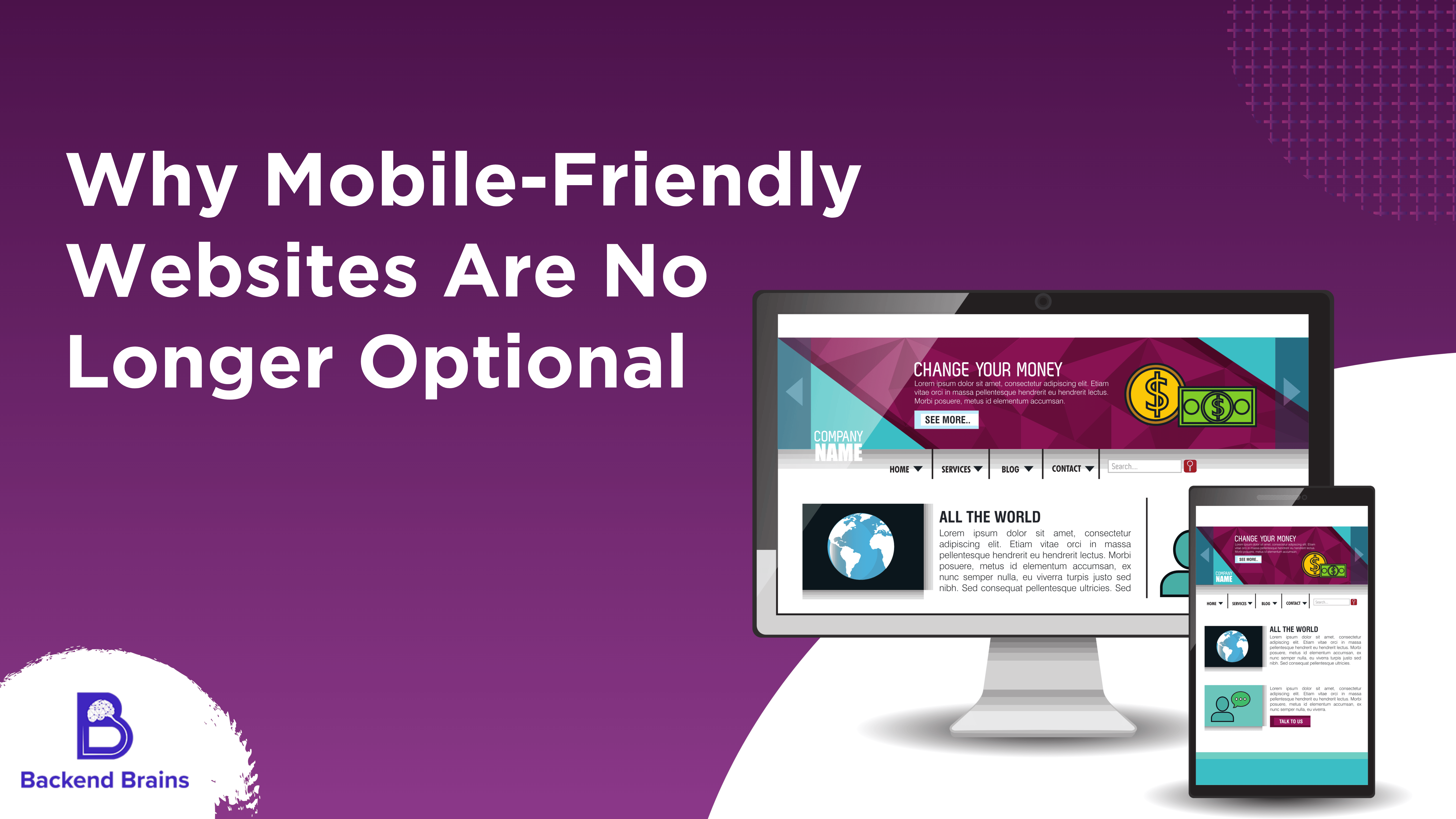
In today's digital world, smartphones have become the primary way people access the internet. Whether searching for services, shopping online, or browsing social media, most users rely on their mobile devices. Because of this shift, having a mobile-friendly website is no longer optional - it is essential for any business that wants to stay competitive.
The Rise of Mobile Internet Usage
Over the past decade, mobile internet usage has grown rapidly. Millions of users browse websites, make purchases, and connect with businesses directly from their phones. If a website is not optimized for mobile devices, visitors often leave quickly and look for alternatives. This can result in lost customers and reduced business opportunities.
A mobile-friendly website ensures that users can easily navigate, read content, and interact with your site regardless of the device they use.
Better User Experience
User experience plays a critical role in the success of any website. A mobile-friendly design automatically adjusts to different screen sizes, making the site easier to use on smartphones and tablets. Features like fast loading speed, clear navigation, and readable text help visitors find the information they need quickly.
When users have a smooth browsing experience, they are more likely to stay longer on the website and engage with the content or services offered.
Improved Search Engine Rankings
Search engines prioritize mobile-friendly websites when displaying search results. If your website is optimized for mobile devices, it has a better chance of ranking higher in search engines. Higher rankings increase visibility, which leads to more traffic and potential customers.
Businesses that ignore mobile optimization risk falling behind competitors who invest in responsive website design.
Increased Customer Trust
A well-designed mobile website creates a positive impression of your brand. Visitors often judge a company's credibility based on its Website Design and usability. If the website looks outdated or difficult to use on mobile devices, potential customers may assume the business is not professional or reliable.
A responsive and modern website helps build trust and encourages visitors to explore your services further.
Higher Conversion Rates
Mobile-friendly websites can significantly improve conversion rates. When users can easily browse products, read information, and complete forms on their phones, they are more likely to take action. Whether it's making a purchase, booking a service, or contacting your business, a smooth mobile experience increases the chances of conversion.
Conclusion
In a world where mobile devices dominate internet usage, businesses cannot afford to ignore mobile-friendly web design. A responsive website improves user experience, boosts search engine rankings, builds trust, and increases conversions. Investing in mobile optimisation is not just a trend - it is a necessity for businesses that want to grow and succeed online.
Hire Expert Developers, Risk-Free for 3 Days
Find, vet, and hire top developers with zero upfront cost.

